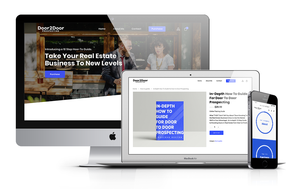
I had the opportunity to work with Brayden to create a website for a door prospecting how-to guide he created for real estate agents. My objective was to inform the potential customer of his product as simply and directly as possible on the homepage using design and content editing so they’d have enough information to buy his product right then and there.

The content is organized in easy to read, eye-catching ways and call to action buttons are placed neatly throughout to guide the reader to purchase. I also formatted his actual how-to guide and implemented it into an e-commerce site.
Color & media
I wanted Brayden’s website to be very professional, but inviting. The colors I chose achieved both by being bright, but not annoyingly so. I added colors to break up potentially text heavy areas to help give the eye a break. I also chose images that help the audience feel comfortable rather than intimidated.
Dark Gray
#417e94
Royal Blue
#c62a41
Turquoise
#2f3530